Monday, April 15, 2013
Rationale
Let me know what you guys think of this.
-----------------------
-----------------------
When the
Waffle House campaign started the company was in desperate need for an
overhaul. They had failed not only in retaining a contemporary aesthetic, but
had also fallen short in providing customers with a satisfactory experience
in-store. It was vital that they improve their overall identity to ensure a
positive future for themselves.
While it was
temping for us to completely change everything about the brand, we also
understood that regardless of Waffle House’s social perception they still had a
dedicated following that had to be considered. Keeping this in mind we examined
the existing Waffle House branding, taking the very few elements of their style
that worked and merged them with a few fresh ideas.
When we
first began we noticed that Waffle House seemed to take great pride in their
“Retro” feel. It also became evident that to a certain extent Waffle House
appeared to be a corporate attempt at making a chain diner much like Denny’s
and IHOP. So, we took the retro diner feel and modernized it, giving it traces
of the retro aesthetic with the cleanliness and minimalistic nature of modern
design.
Regardless
of the few acceptable traits, there were several substandard elements embedded
in the Waffle House brand DNA that had to be omitted during the re-branding
process. The largest portion of the previous designs that had to go was the
overall feeling and layout of the restaurants themselves. This is a part of the
company that appeared to be universally disliked by customers. It seemed out of
date, out of touch, and showed the companies lack of investment in keeping the
brand interesting.
Because of
the insufficiencies, we completely changed the appearance of both the interior
and exterior while retaining the same overall layout (i.e. bar seats, and
booths along the side, etc). It was also determined that a refinement of the
color scheme, website, and logo should take place. Starting with color we
altered Waffle House’s original yellow into a softer hue more reminiscent of a
mustard or gold. This new color also resembled the way a waffle looked when
cooked. To support it, we added several grey tones to the palette to provide a
neutral base from which the gold could be contained by. Alongside the
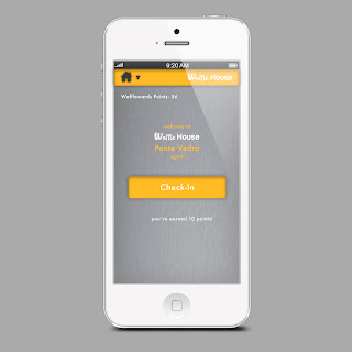
aforementioned, the website, smartphone app, and menu also experienced a
complete overhaul. Each of these had previously featured design that was
embarrassingly out of date and not consistent with the Waffle House brand. As
with the s, we applied our new color scheme and our modernist-retro aesthetic,
adding a much-needed consistency to the brand.
Following
what we had already done in terms of remodeling or altering, a series of new
elements to the brand were incorporated to assist it in expanding its reach to
newer and younger audiences. We needed to communicate to this demographic that
Waffle House was capable of staying in touch and catering to their needs.
The first
idea we came across was for a Waffle House food truck. A recent study
discovered that 59% of American adults say that they would visit a food truck
if their favorite restaurant offered one. The incorporation of the truck was
essential in the process of creating a new consumer base for the company,
especially when that population is urbanizing in increased rates. To comply
with the guidelines we had established as to how we wanted to rebrand the
company, we used a vintage bus and converted it to serve our purposes. Thus,
the “Waffle Truck” was born.
We also
placed installations in high traffic areas of cities to spread awareness of the
new and improved Waffle House. It communicates alongside the other various
elements in the rebranding a new message to consumers that Waffle House is
committed to providing an experience that will leaving them wanting more.
Sunday, April 14, 2013
Saturday, April 13, 2013
Thursday, April 11, 2013
Website Comp
Here is what I have for the website thus far. I will make updates based of the groups feedback. So let me know what you think.
Wednesday, April 10, 2013
Tuesday, April 9, 2013
Monday, April 8, 2013
Restaurant Mood Boards
Mood Boards for the interior of the restaurant
Probably discuss this more in class, but thought I would post it to see what you guys thing. Working on the agency logo right now. Should be able to post by end of the night.
Logo Concept
So this is the concept I came up with for the logo. The top sign still needs to be refined but I just wanted to imply how it might look. I think the most successful is the last one but I just gave some variations to compare. I used the typeface that Ryan showed in his mood board but substituted the uppercase W for the lowercase w and made some adjustments to the width. The lower case w was more condensed and looked more unified with the rest of the letters.
Subscribe to:
Comments (Atom)


